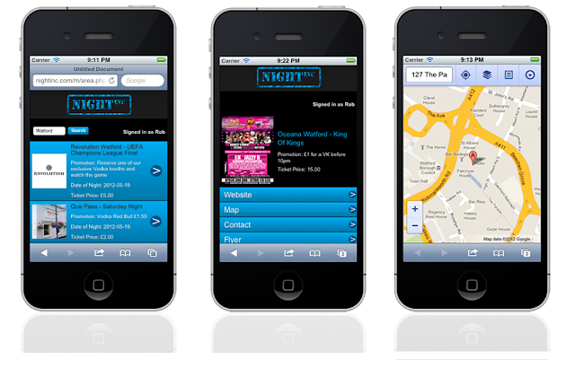
Better Mobile Site Design for Marketing Advantage

According to the latest report, most of the online purchases
are now being made using mobile devices. It means that if you are not having
the mobile version of your website, your business is at the serious risk of
failing against your competitors.
Nevertheless, it doesn’t also mean that having just a mobile
version of the website can guarantee better conversion rates and sales. Mobile
search in order to make a purchase is usually a goal-oriented process as searcher
would probably leave the website if it fails to respond instantly and
effectively. So, it majorly comes down to the design of the website. Better
mobile site design is ultimately going to ensure better conversion.
Having said that, we are going to mention some very
important areas of mobile site design you need to work on in order to make the
overall mobile browsing experience of your website better.
Homepage and
navigation
Homepage is the entry point of your website, so not making
it interesting may distract the users before they even begin browsing through
your website. While you may be willing to make the homepage the promotional
place of your website, it’s recommended that certain elements like homepage
shortcuts, concise CTAs and the need to avoid being overly promotional are
taken care of.

When it comes to navigation, it becomes a little trickier to
design the navigation in a way that site experience is not going to be a bad
one. Making navigation easier in a mobile site design is a bit difficult
because the site has to be displayed in a small screen. So, it is usually
easier for the user to get lost in the navigation some times. To let them get
back to the homepage without a hitch, make sure that you have placed a tapping
point in the design that takes users back to the homepage. Site logo is the
most appropriate element to be selected in this regard.
Commerce and reviews
Users on mobile devices want to browse effortlessly while
searching, reviewing and purchasing the products or services. But, what is the
ultimate way you can make it happen?
Well, you need to let the visitors explore your website
without you asking for anything too soon.
So, it is not highly appropriate to ask the users too early
for signing up in your website. Instead, you can let the users search and surf
in the website. This provides you with an opportunity to let your content be a
driving force to make the users sign up eventually. Furthermore, there should
be more than one payment options for the users.
Report suggests that 92% of the online purchasers read the
reviews about any product before they purchase it. So, you need to make sure
that user reviews on your product pages are arranged well. You can deploy
certain filters to let the users read the reviews in a way they want. The most
common filters are “most recent reviews”, “most positive reviews” and “lowest
ratings”.
Other technicalities
Apart from the great design of your website, make sure that
you are not ignoring anything which is supposed to bring traffic to the website.
I am talking about the on-page optimization. You cannot just copy/paste the
entire configuration form a desktop version into the backend of mobile version.
The mobile site is definitely going to be a changed browsing experience; so
make it searchable on the web while keeping mobile users in consideration.
Comments
Post a Comment